Signage Design | Wayfinding | F&B Branding
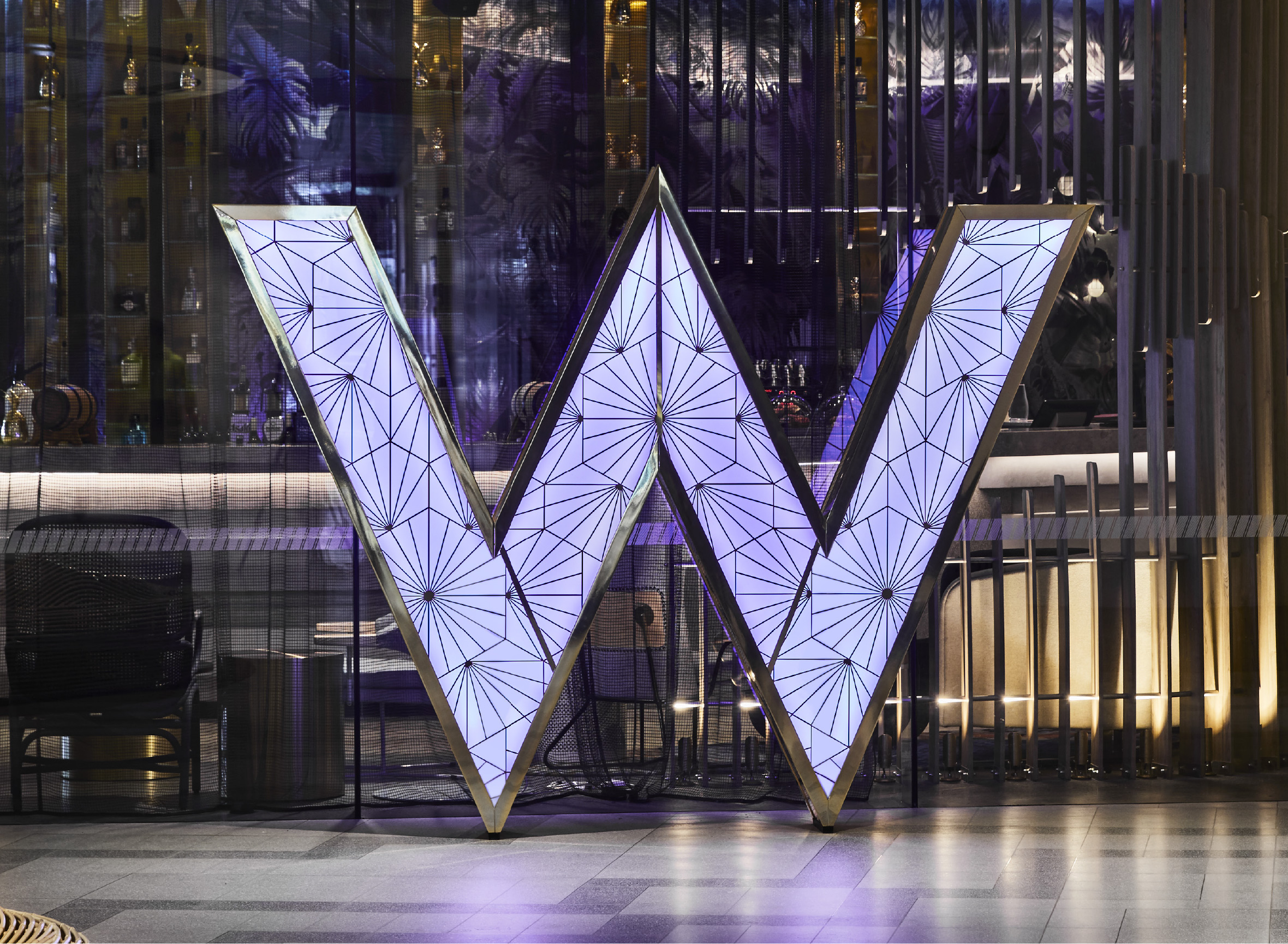
W SUZHOU
China
Evoking a sense of place

Magical
Destination
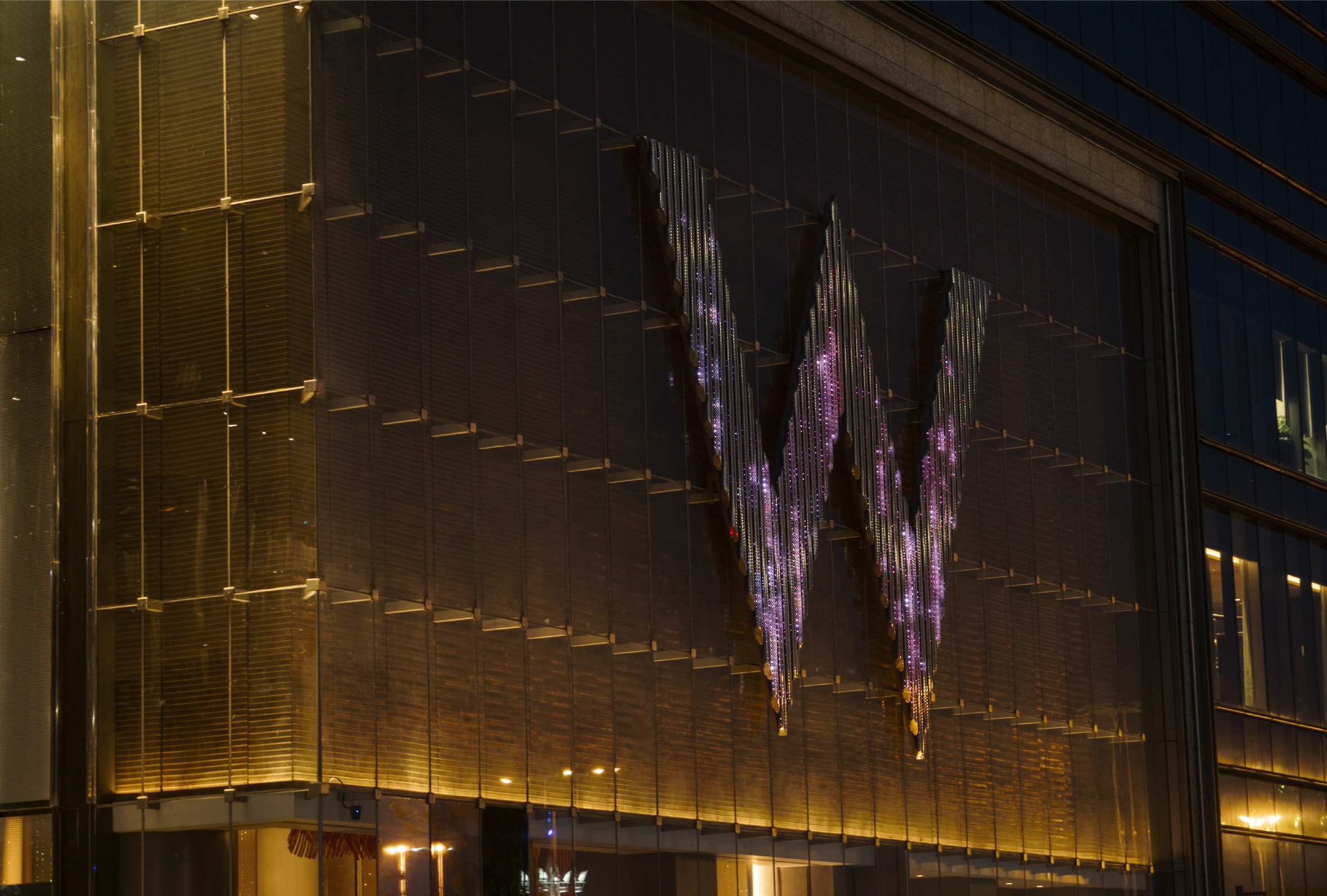
W Suzhou is a uniquely compelling and magical destination to bring to life within the W portfolio. Known as the Venice of China, Suzhou is 2,500 years old and home to spectacular UNESCO classical gardens, canals and ancient water towns. The hotel, designed by Rockwell Group Madrid, highlights traditional and natural elements through the W brand’s vibrant brand palette. These concepts are integrated into the hotel’s aesthetic, reinterpreting lakes, rocks, pavilions and gates as levitating elements woven throughout the hotel. At the porte cochere for example, guests are greeted by a crystal cloud, a dichroic acrylic and metal chandelier that simulates the subtle flow of clouds through changes in lighting and mist.


Overcome
Gravity
Corlette’s signage Design concept for W Suzhou continues the concept of Levitation: to rise or float in the air, especially as a supernatural power that overcomes gravity. Celebrating Suzhou’s famous gardens, the signage is reimagined within a curious, magical, garden-like space where elements float, colours change and imagination overflows.