Signage Design | Wayfinding
ALOFT HOTEL
Perth, Australia
Clean, contemporary architecture houses open spaces that are alive with activity

Vibrant
Spaces
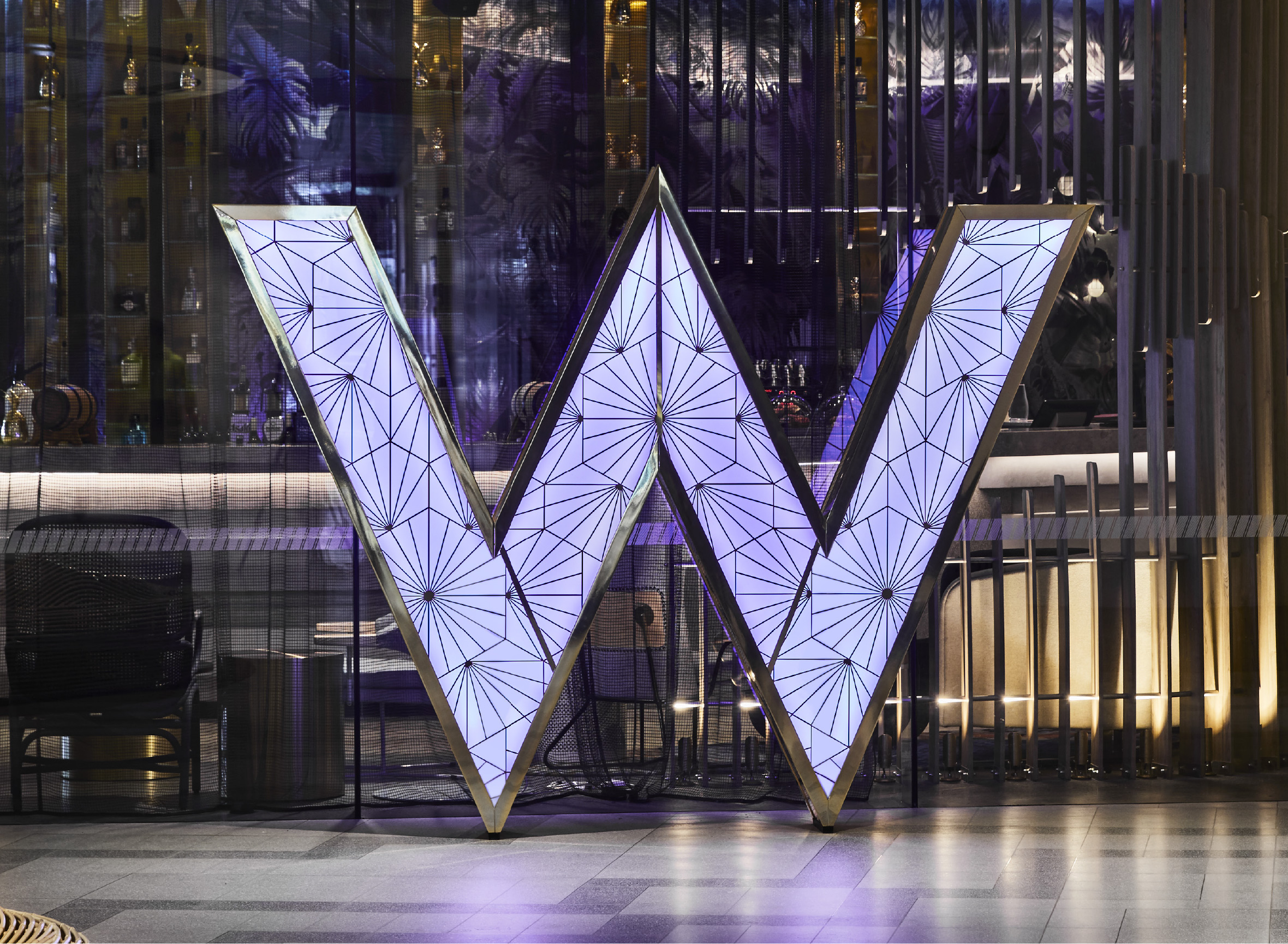
The Perth hotel is Aloft’s first step in to the Australian market. Clean, contemporary architecture houses open spaces that are alive with activity. A vibrant social scene starts with the signature WXYZ® bar, hosting live music from up-and-coming local artists. Artwork from local, West Australian artists, include works by Anya Brock and David Spencer. Aloft Perth was built by BGC Development in partnership with Starwood Hotels and Resorts. Part of The Springs mixed-use development, the hotel offers a modern all-day dining venue, and event spaces with panoramic views of the Swan River.

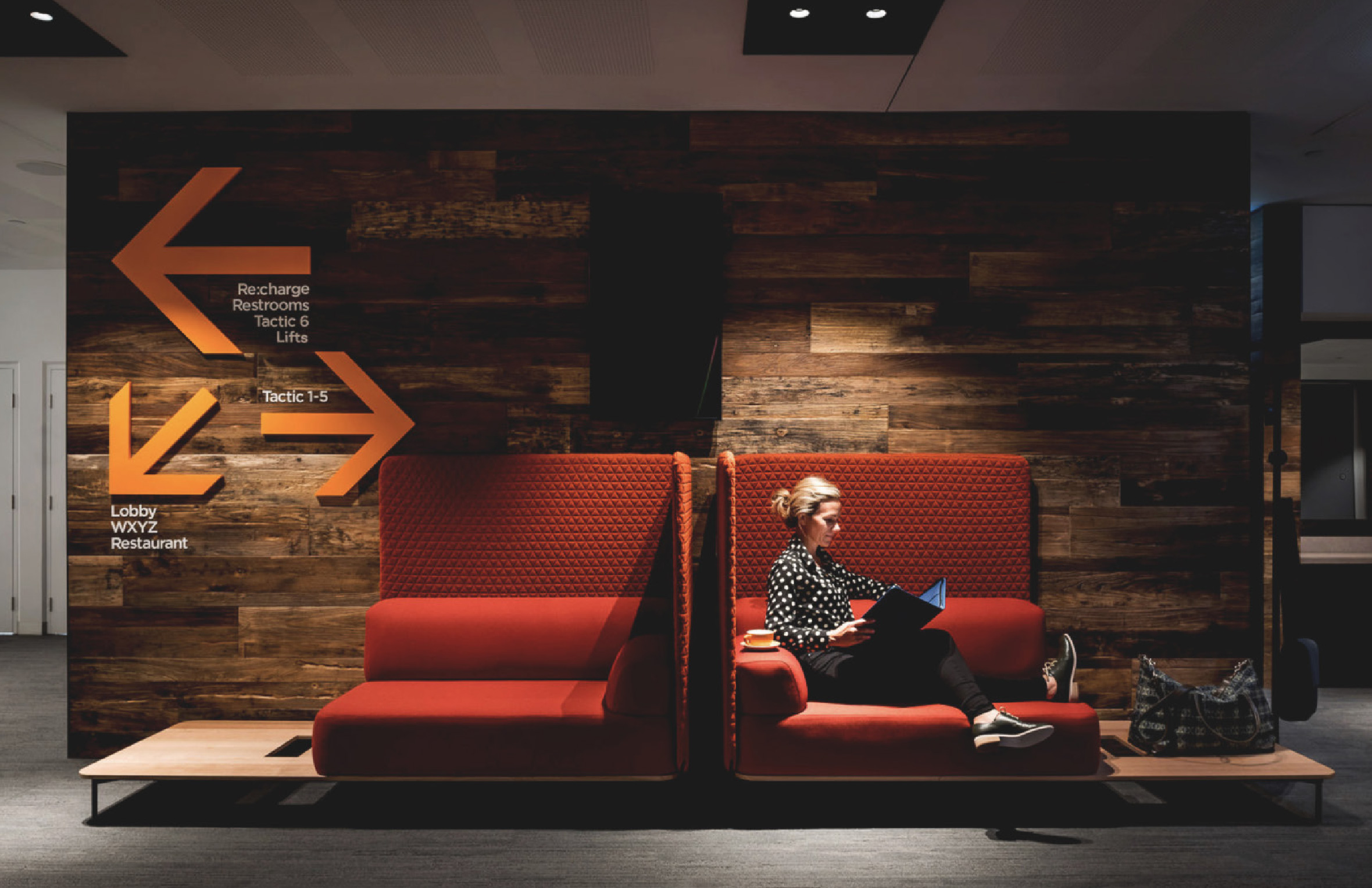
Different by design, our work for Aloft Perth embodies the open and upbeat hotel concept

New Kind of
Experience
Aloft Perth brings a new kind of hotel experience to West Australian shores. Different by design, our work for Aloft Perth embodies the open and upbeat hotel concept, with its industrial, urban aesthetic, sophisticated design and savvy use of space. Our final designs pushed the boundaries of Aloft’s brand guidelines, to better reflect the bold interiors. Oversized iconography, intense colours, concrete finishes, and stencil lettering all inject a dynamic street aesthetic into the final signage program.
Already making its mark, Aloft Perth recently won a slew of Industry Awards, including Winner of AHA WA 2017 Accommodation Industry Awards, Best Superior Accommodation Hotel.