• Waldorf Astoria Beijing

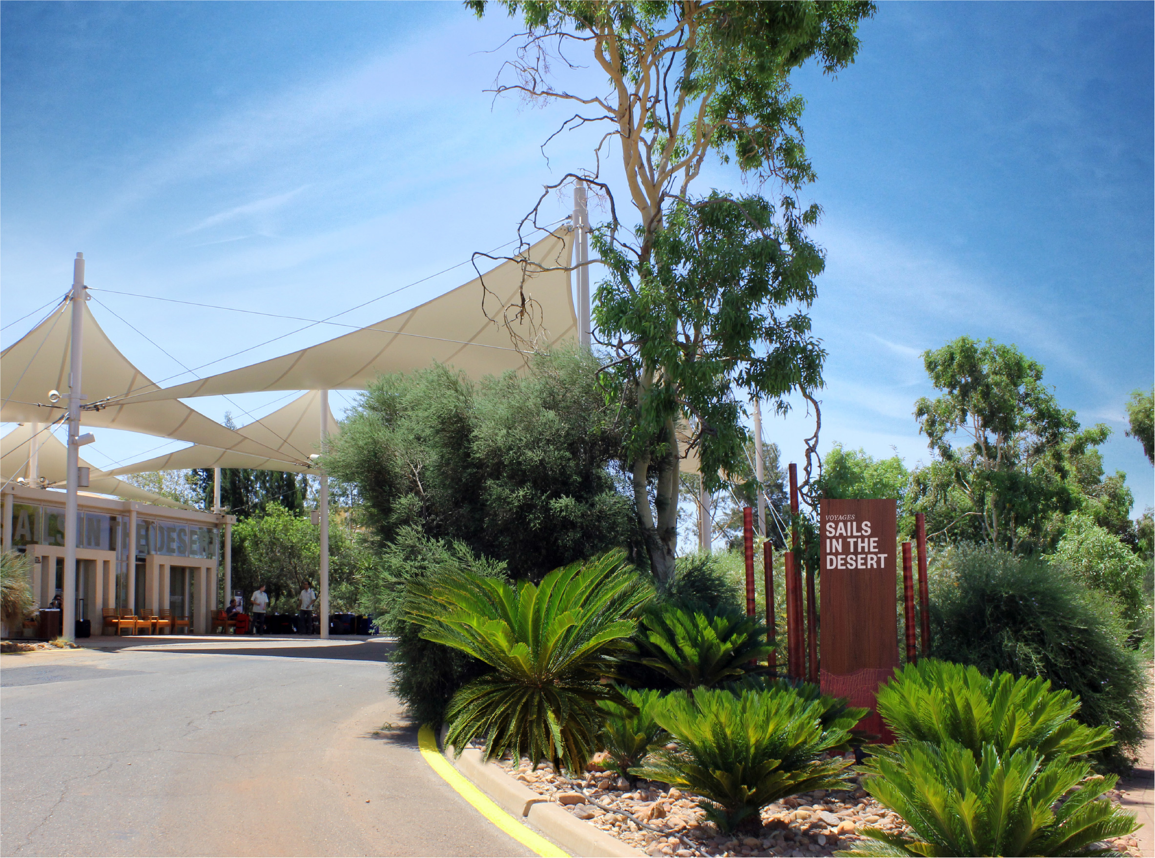
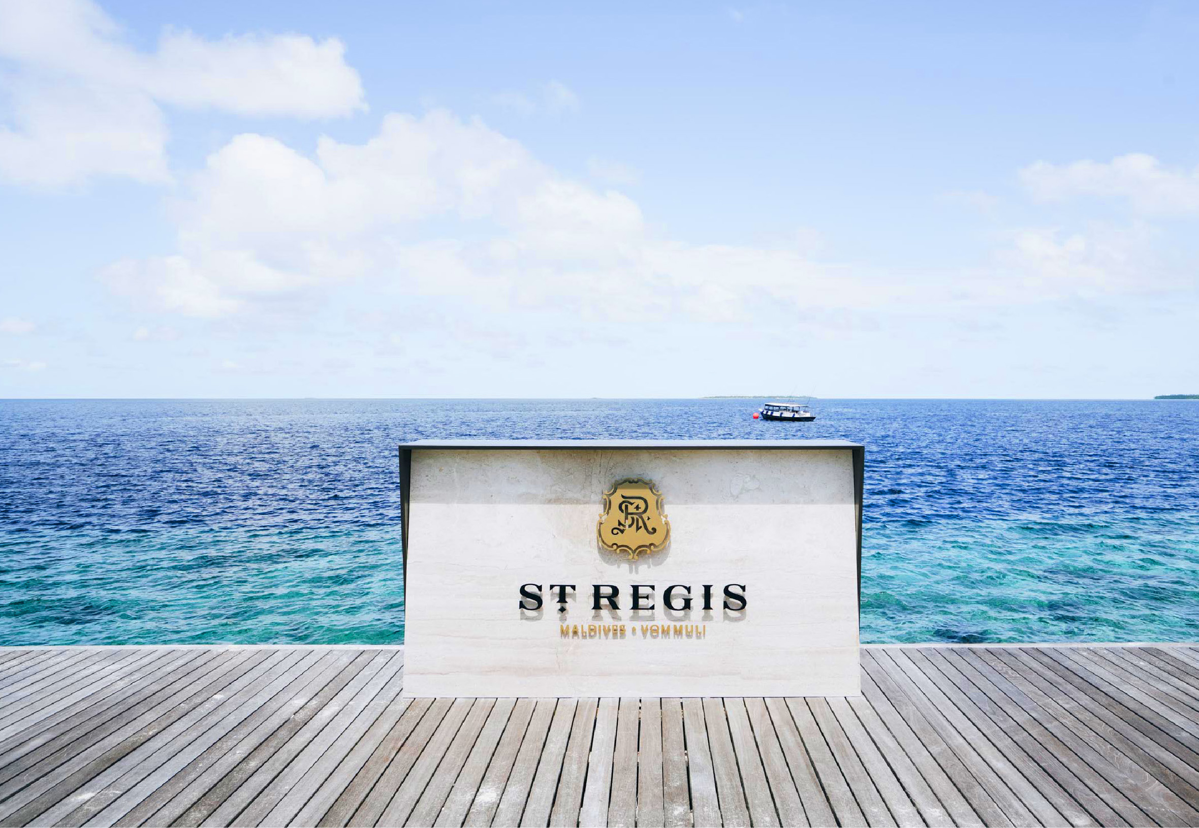
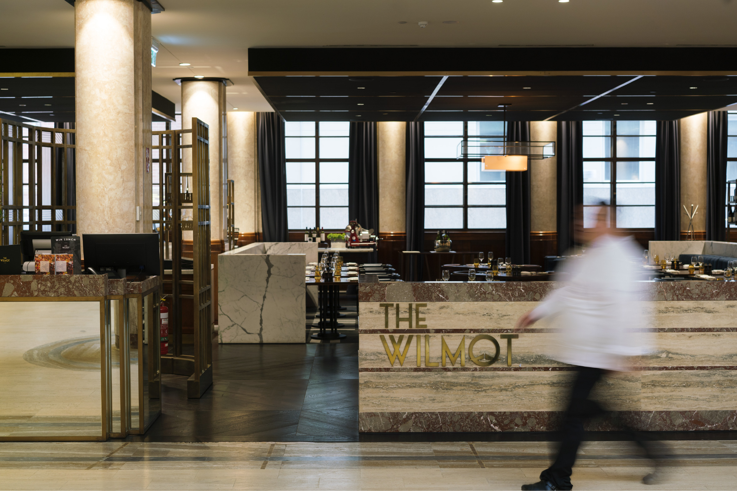
    Signage Design | Wayfinding | F&B Branding | Graphic Design
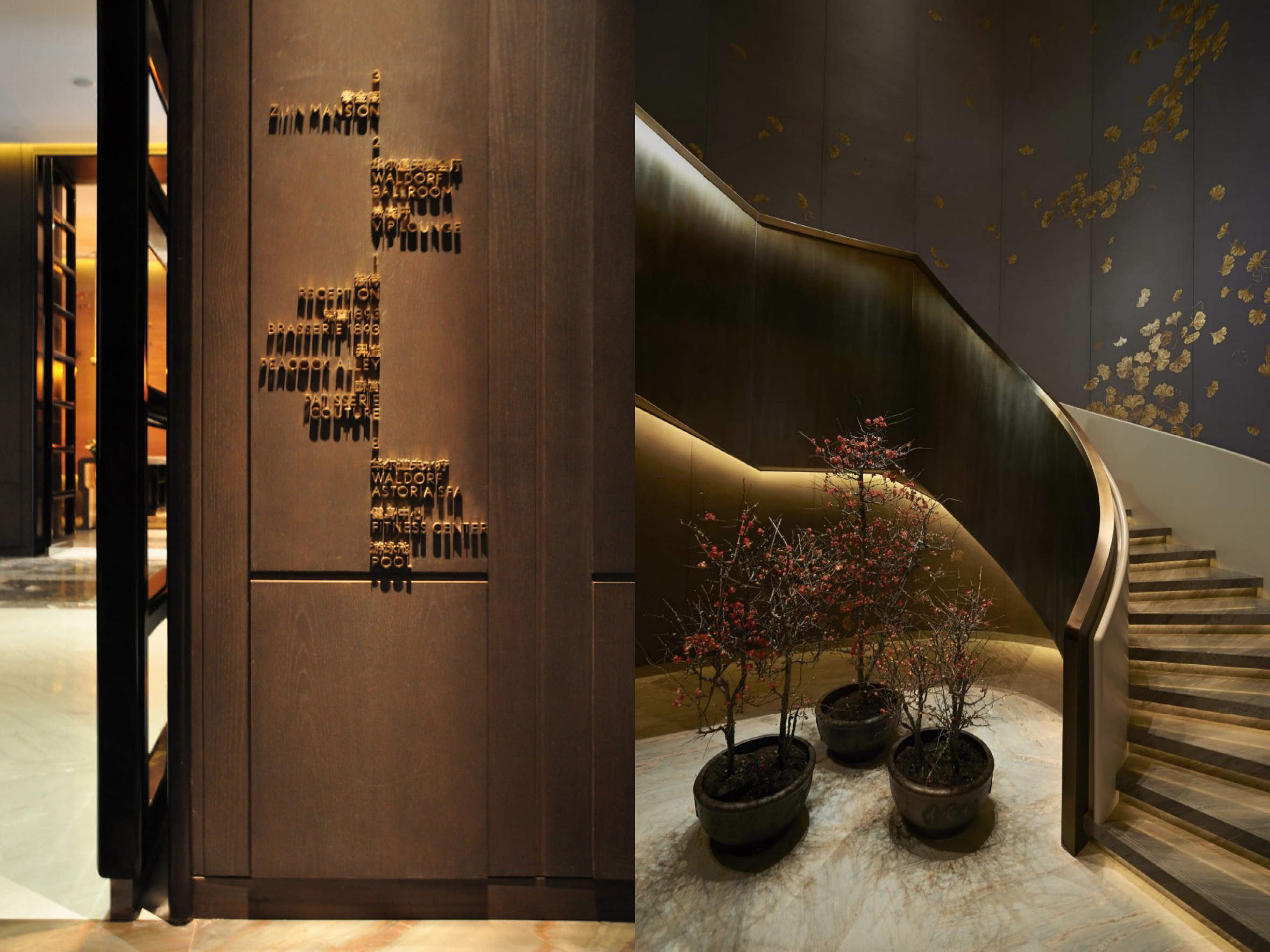
    WALDORF ASTORIA

    Beijing, China

    Rich Chinese tradition and modern affluence flawlessly combined.

    Modern
    Elegance

    Rich Chinese tradition and modern affluence flawlessly combine at Waldorf Astoria Beijing. This distinctive hotel, where Oriental charm meets contemporary luxury, is located in the heart of the Wangfujing area.

    Inspired and impeccable, every signage detail communicates a more refined guest experience.

    Contemporary
    Luxury

    The Waldorf Astoria Beijing blends modern elegance, rich Chinese heritage and legendary Waldorf service to create a unique hospitality experience. Consequently, the wayfinding and signage program is sleek, stylish, and opulent. Inspired and impeccable, every signage detail communicates a more refined guest experience.

  • The William Inglis Hotel Signage Design and Wayfinding

    Signage Design | Wayfinding

    THE WILLIAM INGLIS HOTEL – MGallery by Sofitel

    Sydney, Australia

    The William Inglis Hotel embodies an iconic destination with rural soul

    Rich & Unique
    Heritage

    William Inglis & Son commissioned Corlette Design to deliver a comprehensive signage and wayfinding design program for The William Inglis Hotel and Riverside Stables. The Inglis family are internationally renowned bloodstock auctioneers, most notable for their world-famous Sydney Yearling Sales. Inglis is an iconic Australian brand, built on a 100-year heritage of continuous operations in Newmarket, Australia. The business relocated operations to Warwick Farm, partnering with M Gallery by Sofitel to establish The William Inglis Hotel, alongside the Riverside Stables. $140 Million investment in the future of the company, Arthur Inglis stated that the goal is ‘to set the business up for another 100 years’. Signage and wayfinding needed to embody the Inglis brand vision whilst preserving its rich and unique heritage. Located at Warwick Farm, in Sydney’s evolving Western Suburbs, the new hotel and precinct opened for operations in February 2018.

    Celebrating a passion for equine culture and providing heartfelt hospitality

    Rural
    Soul

    The William Inglis Hotel and Riverside Stables wayfinding and signage design narrative embodies an iconic destination with rural soul, celebrating a passion for equine culture and providing heartfelt hospitality generations in the making. Every signage detail is highly considered, bringing brand equity across from Newmarket; the pennants of Sale day, rural cues in replica rooftop typography, barn bracket details on exterior signage, carefully researched reproductions of historical Inglis fonts, exquisite saddlery and craftsmanship in interior directionals, stable hook detailing, and architectural cues in graphic elements such as arrows. So too, leather, brass, and timber materiality are carried over from Newmarket to communicate rich luxury, equine culture, and hospitable warmth.

    From the beginning, Corlette understood our longterm vision for the business, and they worked closely with our other partners to achieve it. Relocating to Warwick Farm has been a bold undertaking… and we’re delighted to see the Inglis heritage celebrated through design, often in unexpected ways. I have received compliments on our beautiful signage, it is something people notice and respond to. It has been a great experience working with Corlette.

    ARTHUR INGLIS

    Director & Deputy Chairman William Inglis & Son Limited

  • Wolgan Dining Room

    F&B BRANDING | GRAPHIC DESIGN

    EMIRATES ONE&ONLY DINING ROOM

    Wolgan Valley, Australia

    CONNECTION
    TO NATURE

    Emirates One&Only Wolgan Valley strive for meaning and permanence in how they grow and procure food, and how they contribute to the inspiring narrative of Wolgan Valley. Continuing a decade-long partnership with Corlette, having previously collaborated on branding, marketing, photography, and publications, One&Only Wolgan Valley approached us to create Food & Beverage branding for three distinct venues; Country Kitchen, Wolgan Dining Room, and 1832 Heritage Homestead and Kitchen Garden. After an immersive guest experience, and interviews, a suite of venue brands were developed– seeking to be in tune with nature and the earth.

    The fine copper foil detailing adds a sense of luxury, whilst the powder green stock used for the breakfast menu reflects the panoramic morning views

    Sense of
    Place

    The signature-style logo for Wolgan Dining Room captures the essence of the highly personalised, exclusive, yet relaxed feeling you experience as a One&Only Wolgan Valley guest. Highly stylised black and white photography, captured on site during our guest immersion, is in keeping with the One&Only brand. Uncoated, earthy paper stocks represent the resorts deep connection to the land. The fine copper foil detailing adds a sense of luxury, whilst the powder green stock used for the breakfast menu reflects the panoramic morning views. This considered branding for Wolgan Valley contributes to the important, ongoing culinary conversation about the purity, ingredients and sense of place that is the Greater Blue Mountains.

    AGDA Design Awards Finalist 2019
    AGDA Awards Logo@2x-80
  • W Maldives Hotel Signage Design and Wayfinding

    Signage Design | Wayfinding | Graphic Design

    W MALDIVES

    Fesdu Island

    A tropical playground with a true W Wow effect!

    Quiet
    Contemplation

    W Maldives in the Indian Ocean is a million miles from anywhere. Starwood approached Corlette to help launch the Group’s first luxury Retreat & Spa in the Maldives. W Retreat & Spa Maldives is a private, boutique resort located in North Ari Atoll on the exclusive island of Fesdu. The Retreat & Spa’s philosophy is one of quiet contemplation, where you can escape convention and completely unwind. Our challenge was to deliver a way-finding, signage and brand package in tune with this philosophy and sympathetic to the resort’s tropical location.

    Inspired by the natural surroundings of crystal blue waters and white-sandy beaches

    Barefoot
    Luxury

    Inspired by the natural surroundings, crystal blue waters, white-sandy beaches, and the sand in between our toes, the creative concept of Barefoot luxury came to life. Our approach to the signage and wayfinding is, quite literally, from a very different angle. A bespoke font was developed and featured in directional messages, embedded within the sand, alongside island pathways. The copper studded lettering, over time, has beautifully oxidized changing to an exotic aqua that echoes the turquoise lagoon. Barefoot luxury is also carried through into the Spa, and Food & Beverage facilities where you will find signage inlaid on overwater boardwalks. Room numbers and directional signage are designed to seamlessly integrate into the landscape overwater, beach and island villas.

  • W Shanghai Hotel

    Signage Design | Wayfinding | Graphic Design

    W SHANGHAI

    China

    In the heart of one of the world’s most energetic cities

    Defying
    Expectations

    W Hotels Worldwide, part of Marriott International, unveils W Shanghai – The Bund, in the heart of one of the world’s most energetic cities. With limitless views overlooking the Huangpu River, W Shanghai will set the scene on the North Bund. Owned by Sinar Mas Group, the hotel features a blend of bold design and decadent style which combines to create a captivating contrast of Shanghai’s past and its avant-garde present.

    W is defying expectations and breaking the norms of traditional luxury

    Captivating
    Contrasts

    W is defying expectations and breaking the norms of traditional luxury wherever the iconic W sign lands. That’s why Corlette’s deconstructed, faceted entry sign is a bold, larger than life, sculptural statement. A highly crafted glass artwork, it reflects the coming together of the old and new, rotating through different colourways to light up the night.

    Corlette’s sky sign for W Shanghai is a bold futuristic beacon, set atop the uniquely curved frame of the building’s edifice. Glamorous interior wayfinding is alight with electric fire, and highly reflective, metallic profile-cut letters ‘wow’ and pop on directional signs.

  • W Suzhou Hotel

    Signage Design | Wayfinding | F&B Branding

    W SUZHOU

    China

    Evoking a sense of place

    Magical
    Destination

    W Suzhou is a uniquely compelling and magical destination to bring to life within the W portfolio. Known as the Venice of China, Suzhou is 2,500 years old and home to spectacular UNESCO classical gardens, canals and ancient water towns. The hotel, designed by Rockwell Group Madrid, highlights traditional and natural elements through the W brand’s vibrant brand palette. These concepts are integrated into the hotel’s aesthetic, reinterpreting lakes, rocks, pavilions and gates as levitating elements woven throughout the hotel. At the porte cochere for example, guests are greeted by a crystal cloud, a dichroic acrylic and metal chandelier that simulates the subtle flow of clouds through changes in lighting and mist.

    Overcome
    Gravity

    Corlette’s signage Design concept for W Suzhou continues the concept of Levitation: to rise or float in the air, especially as a supernatural power that overcomes gravity. Celebrating Suzhou’s famous gardens, the signage is reimagined within a curious, magical, garden-like space where elements float, colours change and imagination overflows.

  • Sails in the Desert Hotel

    Signage Design | Wayfinding | F&B Branding

    VOYAGES SAILS IN THE DESERT

    Yulara, Australia

    Sails in the Desert is a destination of exploration and indulgence

    Cultural
    Richness

    Located In the heart of Australia’s Red Centre, Voyages Sails in the Desert hotel beautifully contrasts Uluru’s raw natural beauty with a decidedly luxurious outback holiday experience. In a destination where one of the world’s oldest cultures still thrives, the mystery, colour and wisdom of the local Anangu people is interwoven into every facet of Sails in the Desert’s modern design. More than luxury accommodation, Sails in the Desert is a destination of exploration and indulgence.

    Sails integrates the warmth, vibrancy and natural linear patterning of Uluru

    Desert
    Dreamtime

    Voyages engaged Corlette to deliver the wayfinding, signage and branding programme for Voyages iconic suite of tiered Uluru hospitality offerings. Overwhelmed by the beauty of the land, our Desert Dreamtimeconcept for Sails, integrates the warmth, vibrancy and natural linear patterning of Uluru. Local reclaimed timber is the base material used throughout the exterior wayfinding program. The timber signs feature a wraparound panel digitally printed with different graphics, illustrated with an Uluru pattern. Integrated in to the landscape, the signage blends beautifully with the surrounds of red earth, and native flora and fauna. In reference to indigenous heritage, phonetic pronunciation is heroed in key venue names, allowing the guest experience to become immersive, educational, and emotionally resonant. The results strengthen connections to Uluru and the local Anangu people through language.

  • St Regis Maldives

    Signage Design | Wayfinding | F&B Branding

    ST. REGIS MALDIVES

    Volummi Island

    A truly unique island retreat that celebrates the special relationship between man and nature

    Impeccably
    Crafted

    Tucked away, a distant private island reachable by seaplane invites guests to uncover one of the most luxurious resorts in the Maldives. Combining contemporary design and local craftsmanship with a profound appreciation for the ecological environment– relishing and appreciating a precious habitat. The destination’s narrative is of a modern-day John Jacob Astor, rich beyond measure, who has built an ecologically sensitive home where he and his guests can escape to paradise. A truly unique island retreat that celebrates the special relationship between man and nature, the need to treasure the environment and to live in harmony.

    Paradise Found, draws inspiration from nature itself

    Paradise
    Found

    The creative wayfinding and signage design concept, Paradise Found, draws inspiration from nature itself, from the marine habitat and the various island ecologies. Corlette was engaged to bring this story to life through wayfinding, signage and branding. On arrival guests are greeted with an iconic main identity sign, a Diana marble slab with an aged patina bronze wrap, reflecting the aerial view of exotic mantra rays swimming laconically around the island. Concealed underside lighting for the bronze frame presents a romantic soft glow in the evening, mimicking the hovering movements of the manta rays within shallow waters.

    Wayfinding and guestroom signage integrate with the lighting programme. Various decorative patterns define the different guest accommodation; island, beach, and overwater villas. In the evening stencilled patterns within the signage create beautiful dappled lighting over pathways.

    Corlette designed a complete suite of Food & Beverage logos that were then carefully crafted into ID signage for all venues, across the island.

  • The Wilmot

    Signage Design | Wayfinding | F&B Branding

    PRIMUS HOTEL

    Sydney, Australia

    Charm and grandeur which pays homage to the original art deco design

    ART DECO
    GLAMOUR

    In December 2015, one of Sydney’s finest examples of art deco glamour opened its doors as Primus Hotel Sydney. Perfectly positioned in the heart of the city, this heritage sensitive refit of the former Sydney Water Board headquarters has breathed new life into an iconic 1930’s building. Once empty offices have now been reinvigorated with charm and grandeur which pays homage to the original art deco design. Corlette worked closely with interior design firm Woods Bagot, along with GBA Heritage, to craft a bespoke, integrated and seamless signage design program as an ode to a time of design decadence that remains heritage-listed today.

    ‘Typography with Manners’ was inspired by fascinating historical photographs of the building during its previous life as a public office

    ALL
    MANNERS

    Our design concept, ‘Typography with Manners’ was inspired by fascinating historical photographs of the building during its previous life as a public office. Heritage features of the site, such as original Italian marble columns, were celebrated with complementary finishes and materials to create an elegant, modern feel. Featuring polite language of the times, all messages follow this original tone of voice, elevating the communications and wayfinding and expressing a warmth and hospitality associated with grand hotels of the past.

    Carrying our ‘Manners’ concept in to F&B, Corlette crafted the naming, identity, and branding for The Wilmot fine dining bar and restaurant.