Signage Design | Wayfinding
MANDARIN ORIENTAL
Taipei, Taiwan
A five-star urban retreat in the heart of the city
Old World
Elegance
Setting new standards for hotel luxury, Mandarin Oriental Taipei opened its doors in December 2016, a five-star urban retreat in the heart of the city. With sophisticated design, exquisite restaurants and the largest hotel spa in Taiwan, this luxury escape offers a truly unforgettable experience.
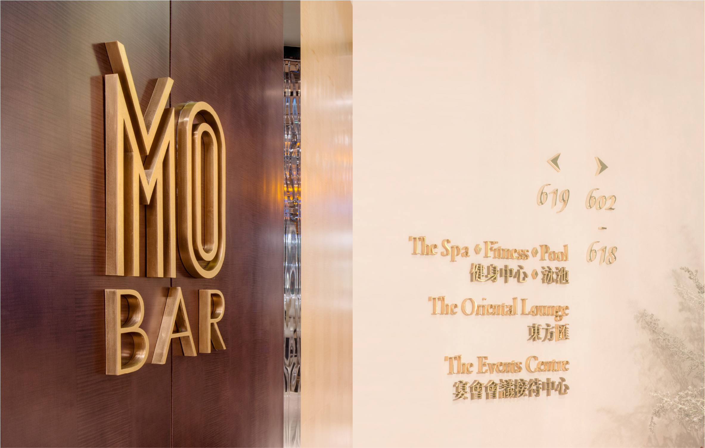
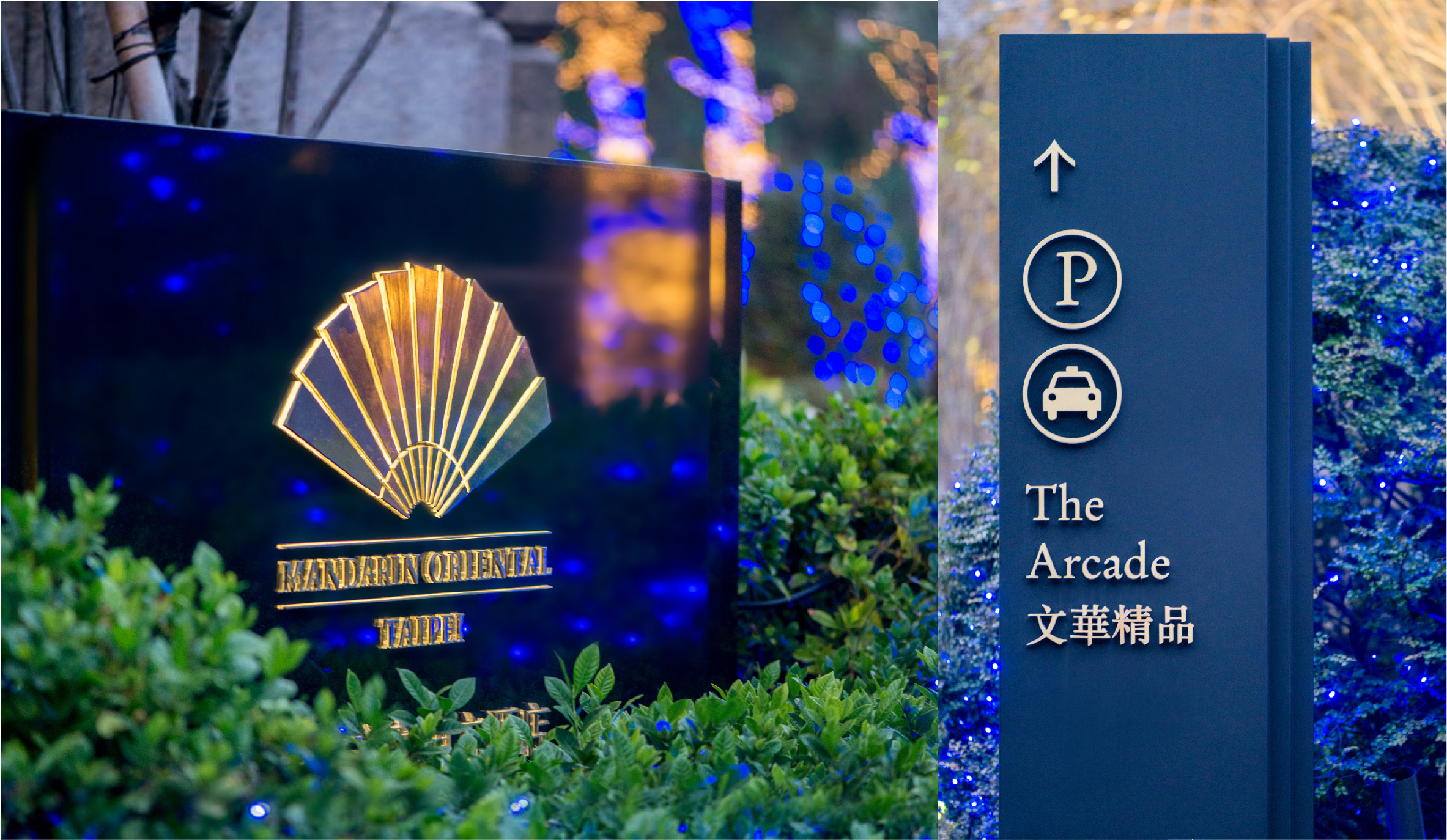
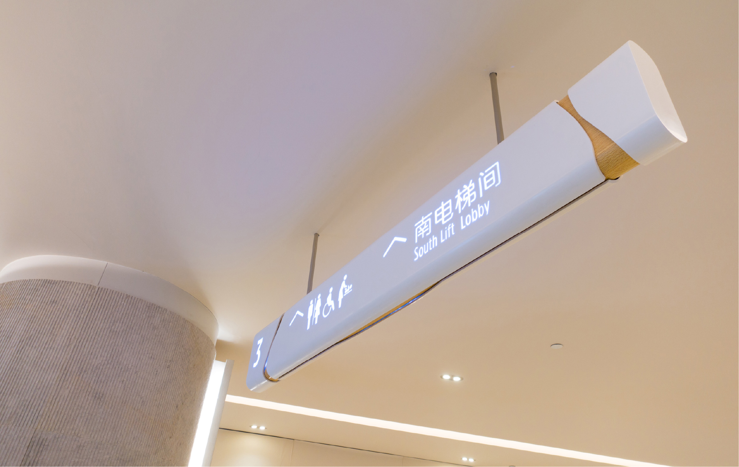
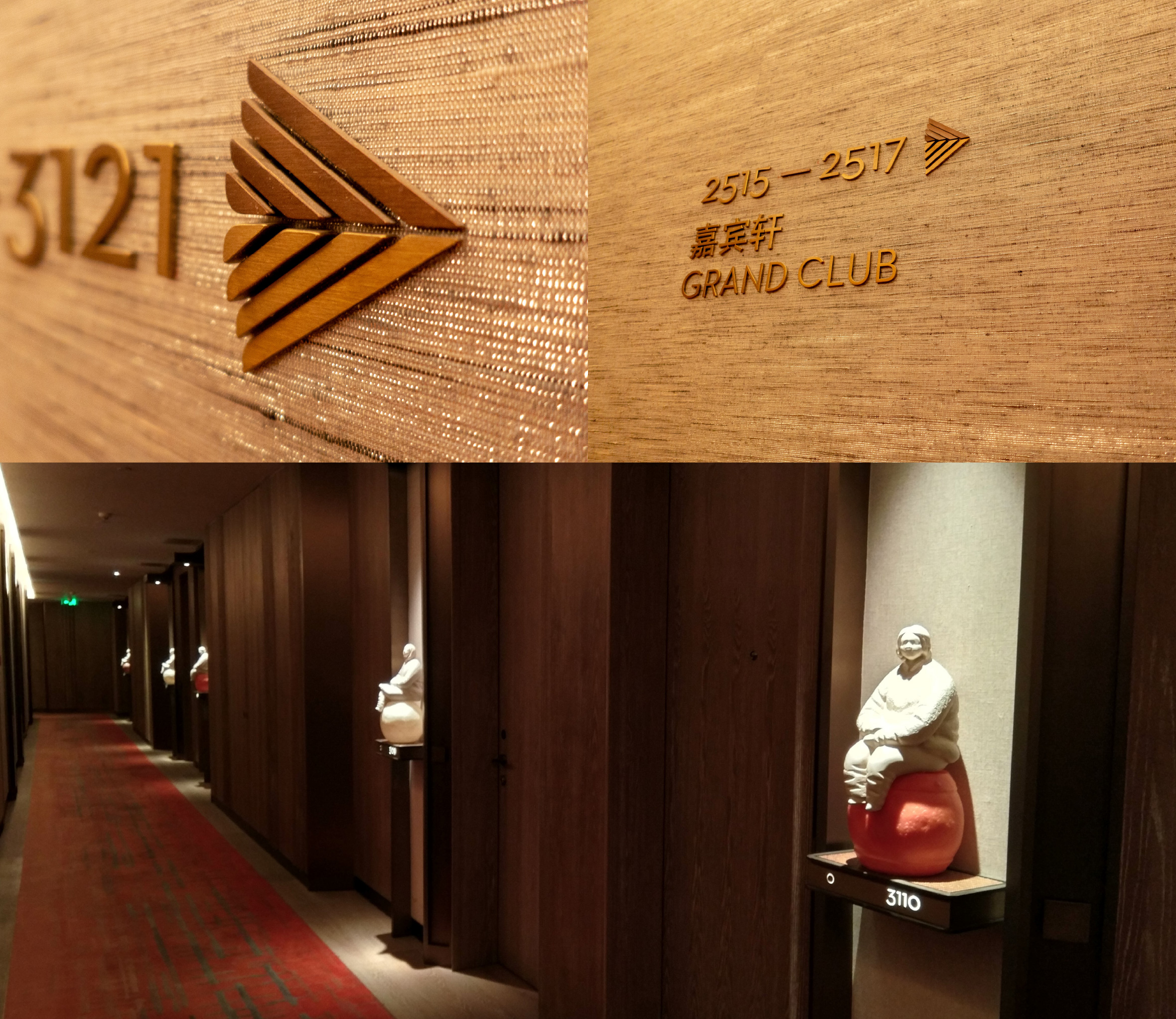
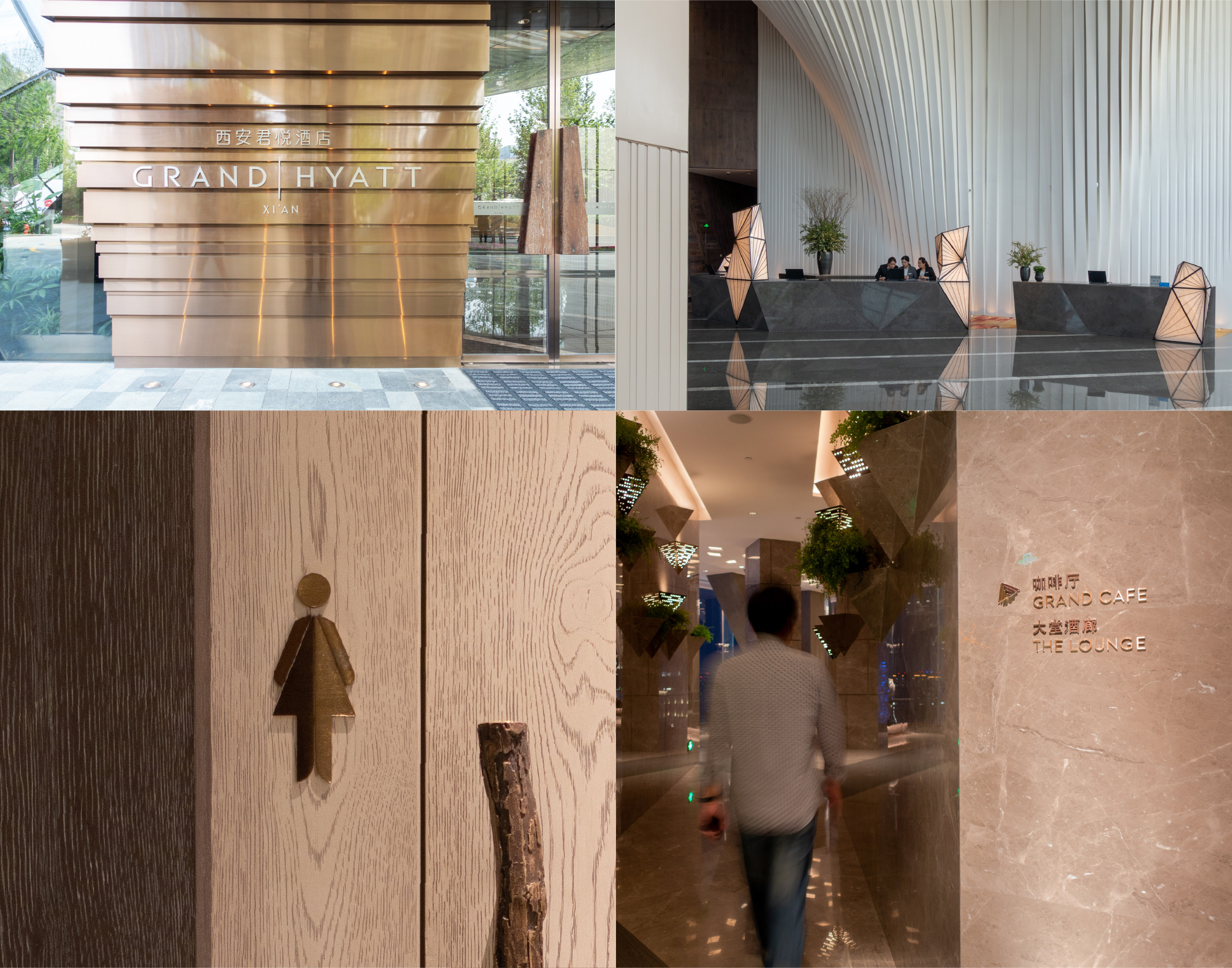
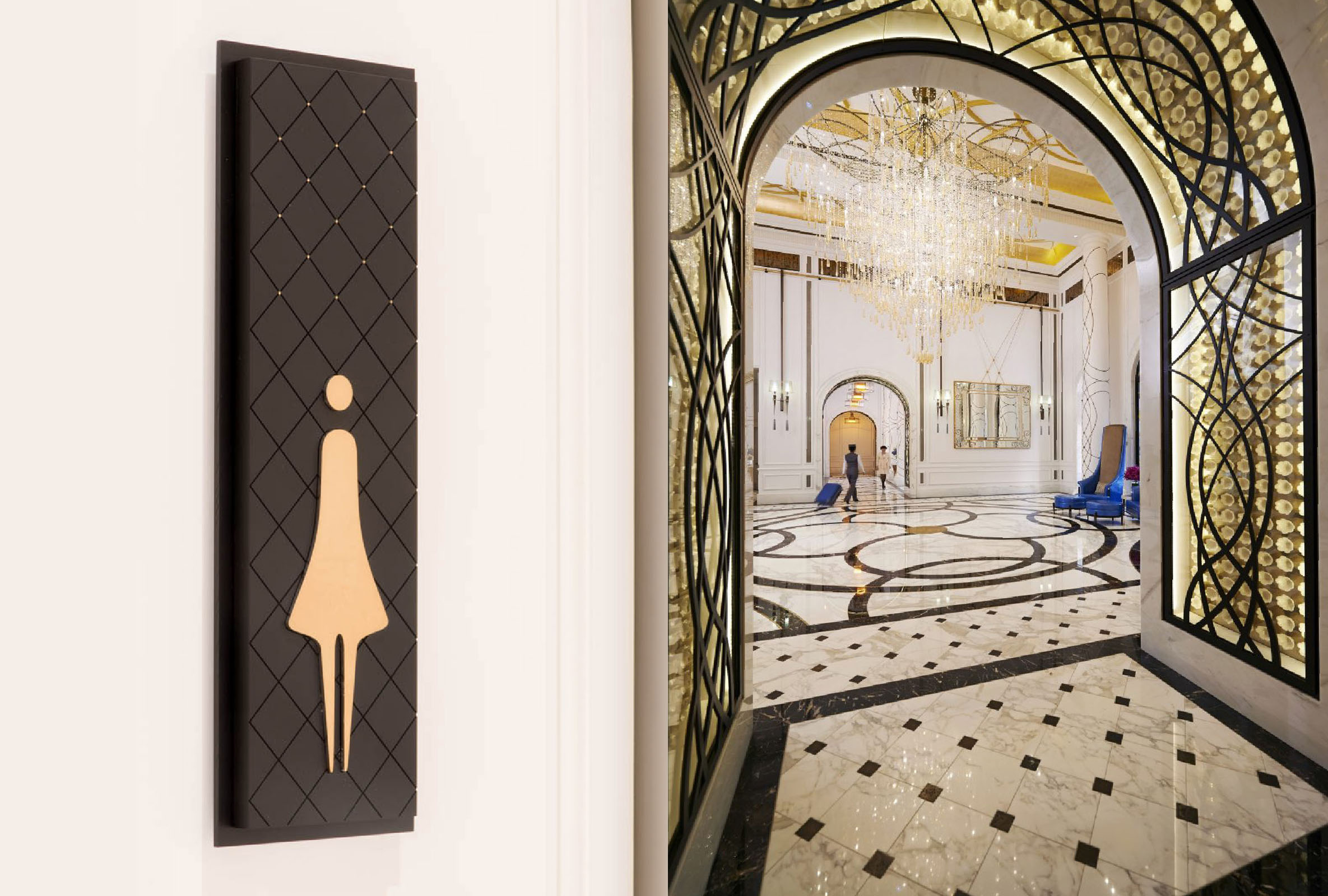
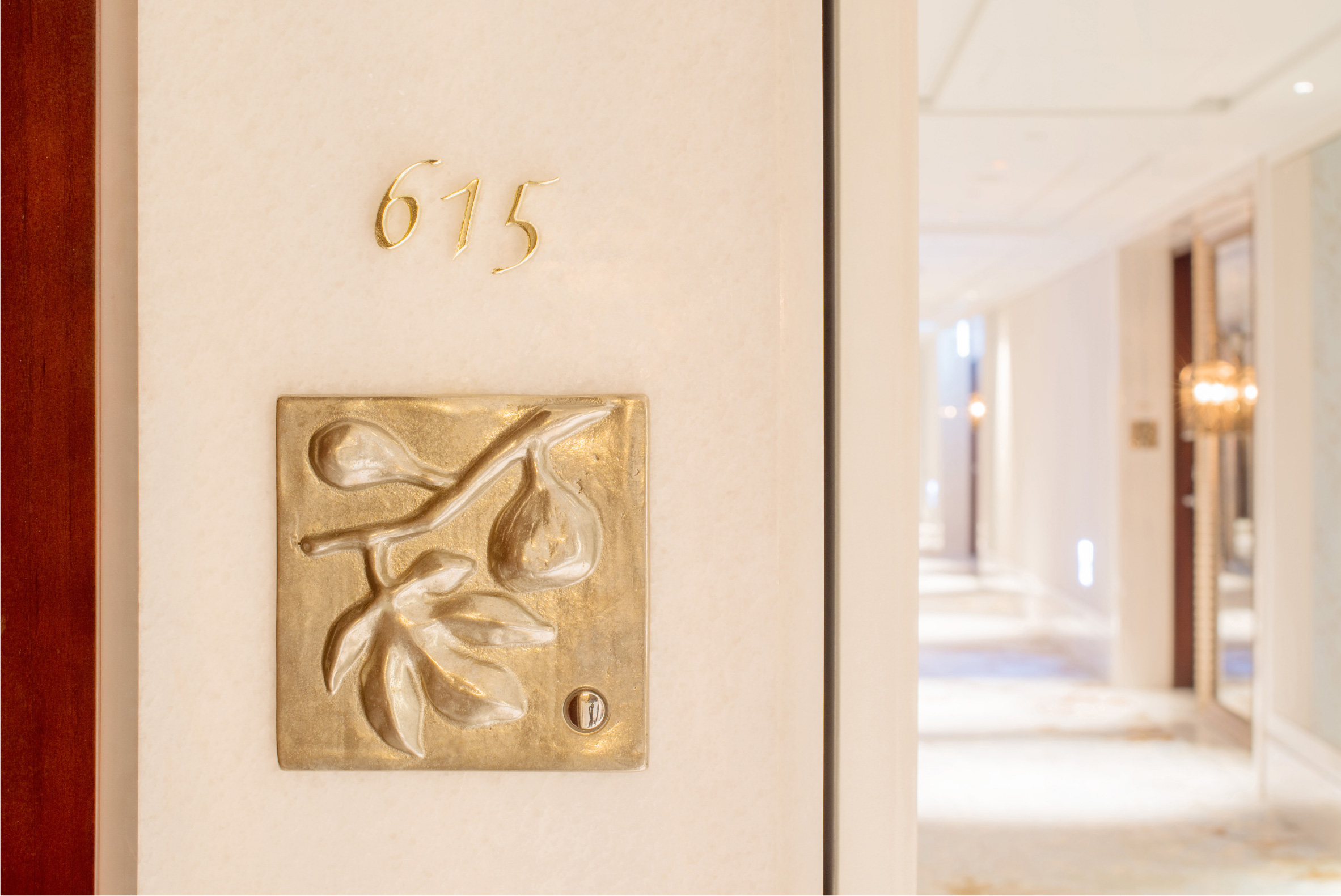
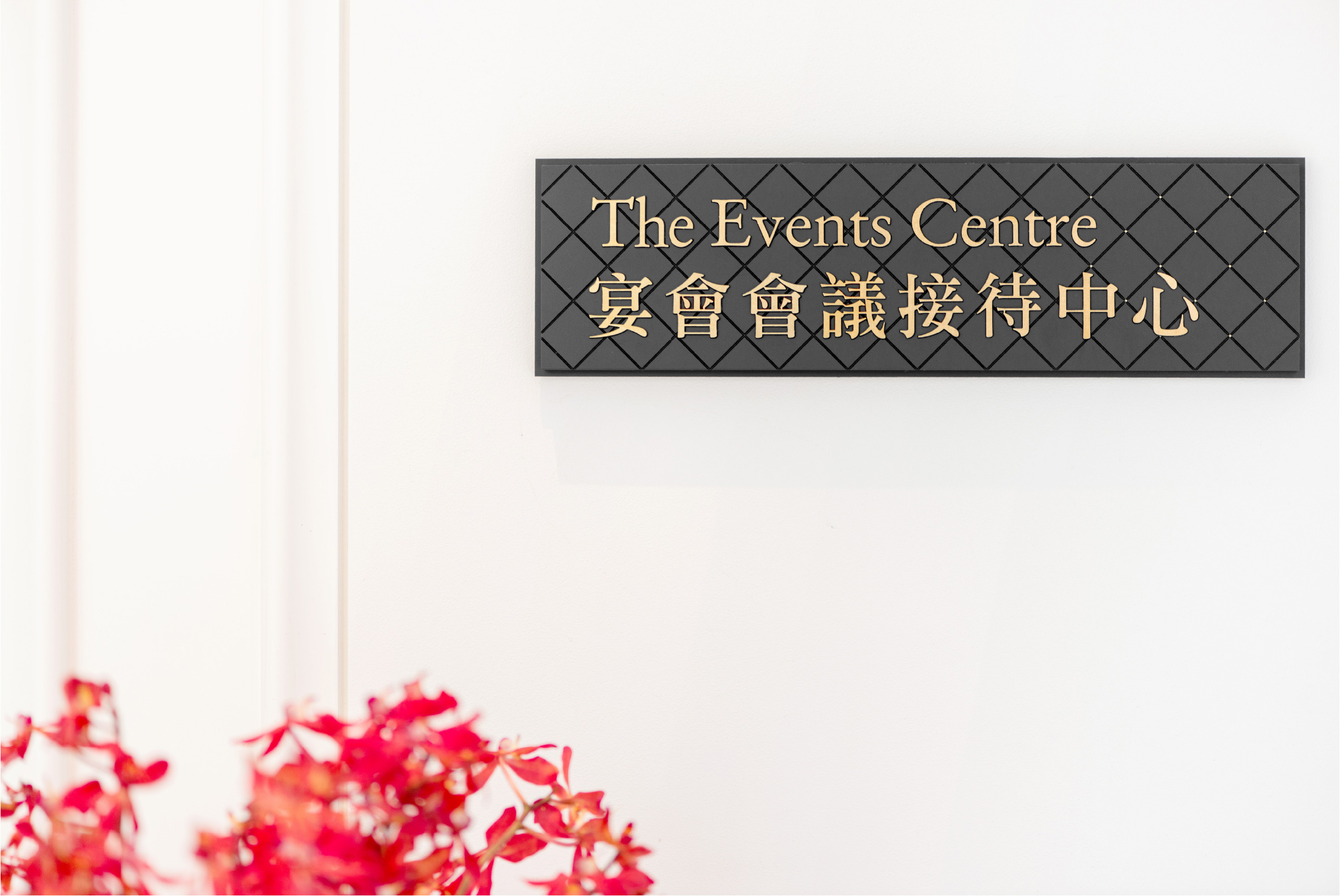
In a bold scheme that borrows from classical European architecture; open air courtyards, formal landscaping, garden terraces and water fountains reminiscent of grand Italian and French residences, the hotel transports you to the golden era of hospitality. The challenge for our signage and wayfinding program was to bridge the divide between modern sensibilities and classical European charm. Mandarin Oriental Taipei signage and wayfinding draws inspiration from signature interior design details. Parquetry patterns are repeated in chocolate engraved and gold-leaf studded interior signs and rich, exquisite gold lettering takes centre stage. Sophisticated materials, considered typography and attention to detail are all reminiscent of old world elegance.
Be transported the golden era of hospitality
Old World
Elegance
Corlette also crafted branding and design for the hotel’s Lifestyle and Food & Beverage outlets. Iconic, sugarcoated branding for The Mandarin Cakeshop and the sophisticated, elegance of the M.O. Bar identity are standouts.
